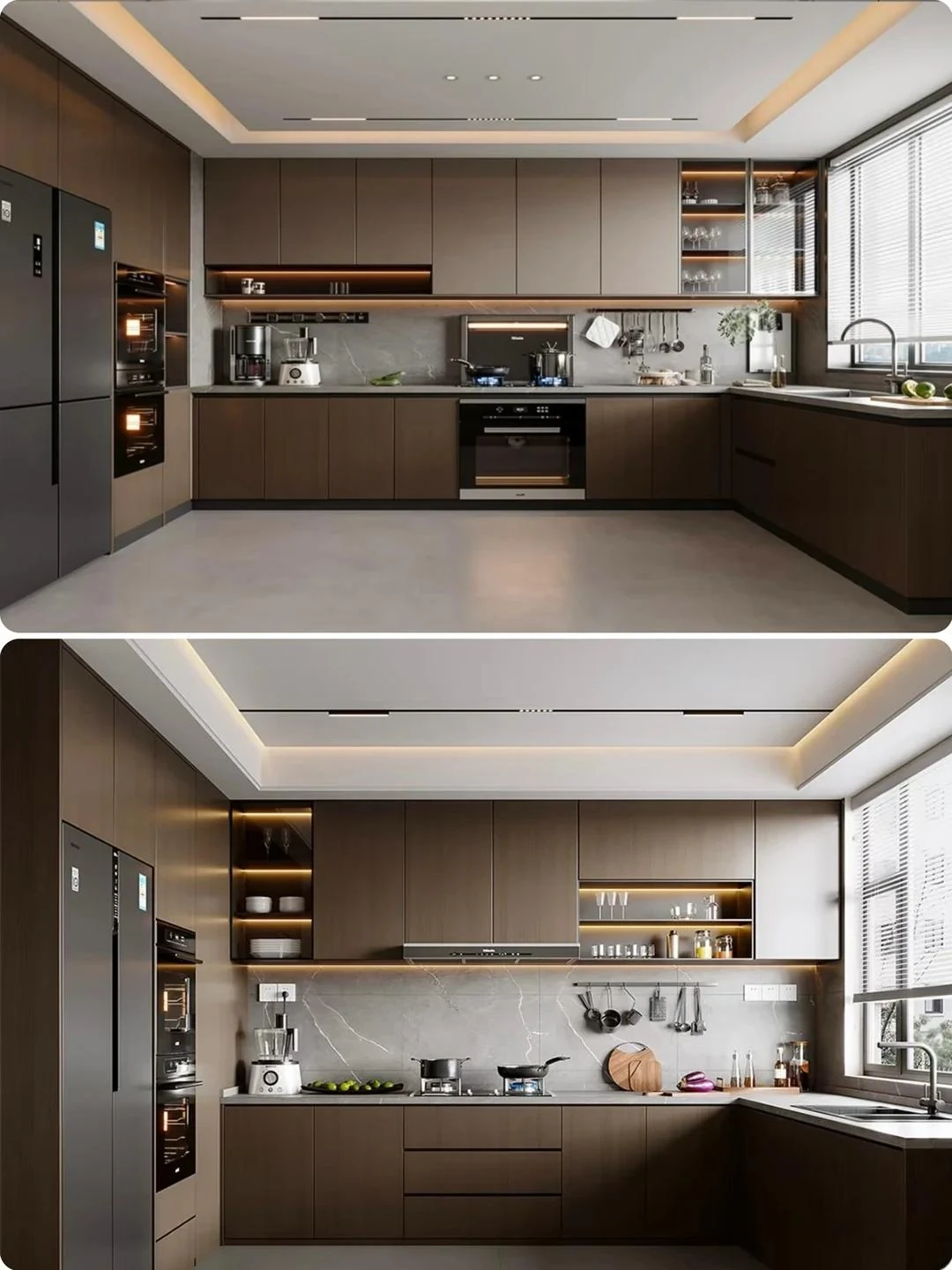
Read trend research for what it measures
The NKBA's public release for its 2026 kitchen trends report, published in September 2025, describes the expectations of industry respondents. In that release, 96% identified neutrals as a leading color group and 86% identified greens. These are survey responses about anticipated directions, not cabinet sales shares or a promise about every market.
Use those findings to broaden the options rather than narrow them prematurely. A neutral can be warm or cool, pale or deep; a green can feel quiet or highly expressive. The useful next step is to identify which direction works beside the room's fixed surfaces and natural light.
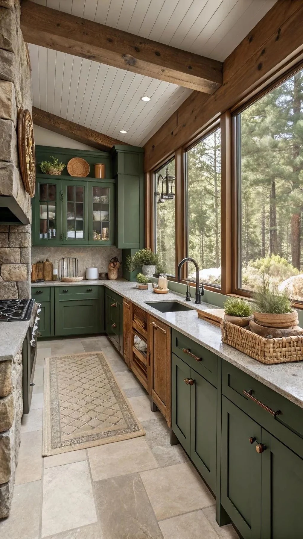
Build the palette around permanent elements
Start with the floor, countertop and any stone, brick or architectural feature that will remain. Place candidate front samples beside them. Look for undertones that support the whole room rather than judging each sample separately. A pale front can appear very different beside a warm timber floor and a cool patterned surface.
Choose a main color and decide where contrast is useful. Tall units, an island or a pantry wall can carry a different tone, but each change should help the composition. Too many competing boundaries can make a simple room feel fragmented. Review the kitchen from the adjacent living and dining areas as well as from inside it.

Use timber as a material, not a flat color
Timber and timber-effect fronts introduce grain, direction and variation. Identify the actual product and review how the grain continues across doors, drawers and exposed panels. A natural veneer sample and a printed surface may share a broad color direction while creating different approval and matching questions.
Ask which variations are expected and how the selected material will be reviewed before production. Coordinate the edge and reverse as part of the front assembly. Where several products imitate or use timber in the same room, compare them together; a similar name does not guarantee a convincing match.

Balance darker colors with the room's light
A deep blue, charcoal or dark timber can create a strong architectural volume. Review the actual sample vertically and from several approach angles. Windows, reflective countertops and artificial lighting change how the front reads throughout the day. Avoid assuming that a dark color necessarily makes every room smaller or that pale fronts automatically make it brighter.
Look closely at touch points and edges under the intended lighting. Discuss care and fingerprint visibility for the specific surface rather than the color category. Our matte versus gloss guide explains how sheen and reflections affect the final impression.
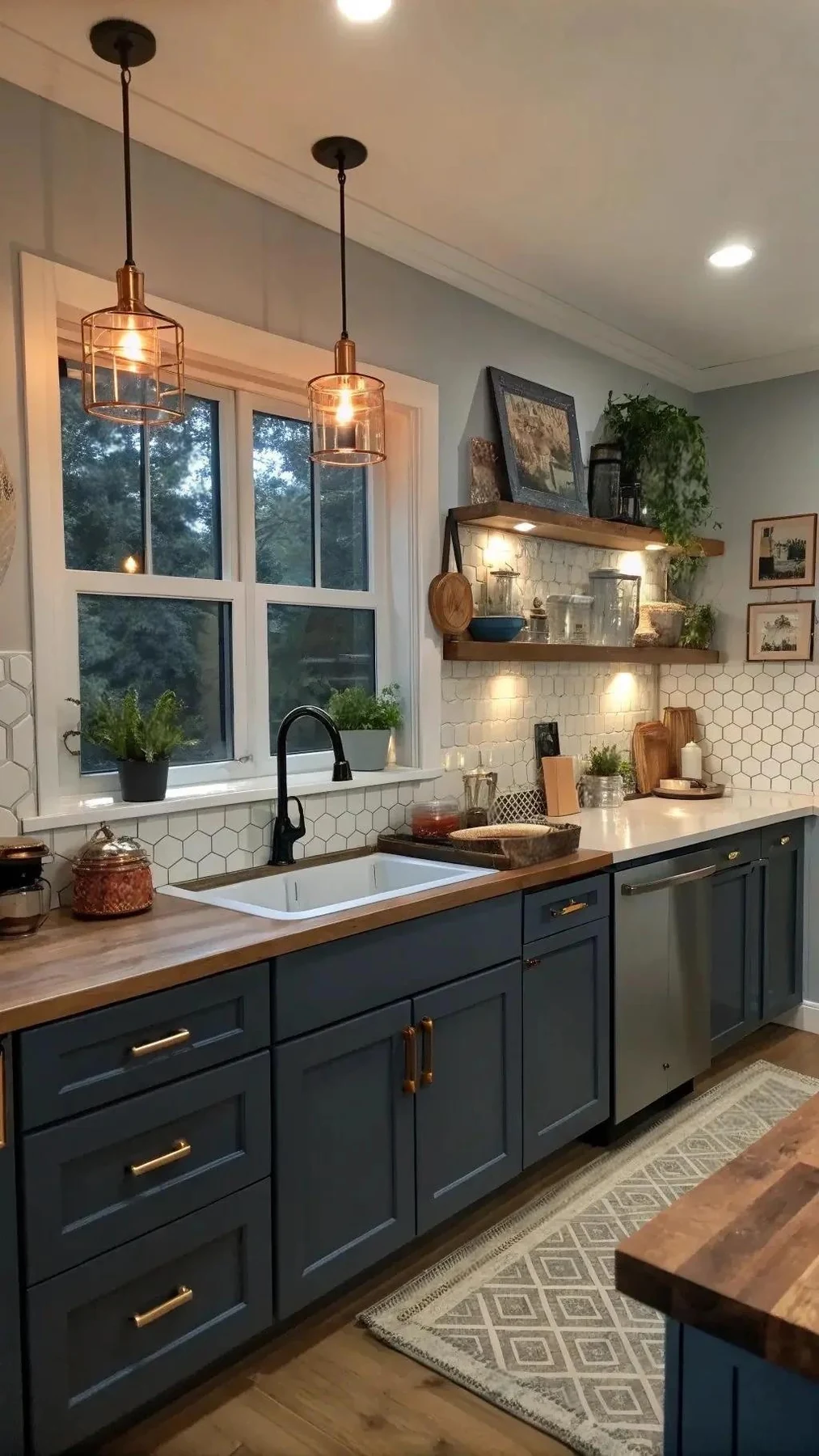
Coordinate the kitchen with the whole home
In an open plan, the kitchen may be visible behind a sofa, through a dining space or from the entrance. Use a repeated material or related tone where it helps connect those views. The composition need not use identical cabinets everywhere, but the transitions should feel intentional.
Consider handles, rails, lighting and appliances within the palette. A metallic detail can appear more prominent on a dark front or beside a warm surface. Keep the material set manageable and review it as a group. The aim is a room that remains coherent when furniture, food and everyday belongings are present.
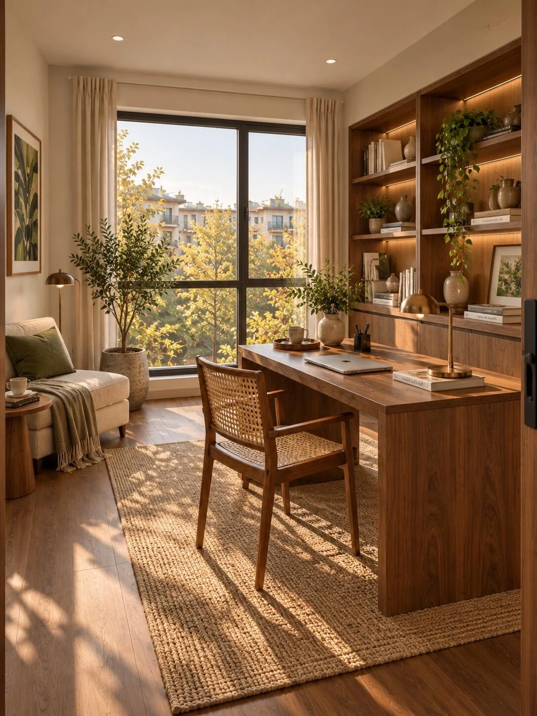
Approve a finish that can be reproduced and cared for
Record the color or product reference, sheen, texture, substrate, edge and accepted sample. Identify any intended variation and any different construction used for exposed panels. Keep reference photographs as inspiration while the actual sample and specification establish the order.
Review care guidance and the agreed replacement or repair route before final selection. Do not choose a finish solely because a trend report predicts its popularity. A well-chosen palette supports the household and the room's permanent materials over time. Continue with cabinet finish systems to turn the visual decision into a complete front specification.

Questions before approval
Does the 2026 report show what most people bought?
The cited public release reports industry respondents' expectations. Its percentages should not be presented as sales data or universal consumer preferences.
Should the island match the perimeter cabinets?
Either approach can work. Review the room's composition, fixed materials and adjoining spaces, then use contrast where it has a clear visual purpose.
Can a color name be the whole specification?
Include the actual product or coating, sheen, substrate, edge and accepted sample. Identical color names across different materials do not establish an exact match.